One of the more productive procrastination activities while writing my thesis was to play around with the extraction, filtration, and visualization of data from the World Ocean Database (WOD), which contains world’s largest open collection of quality controlled ocean profiles.
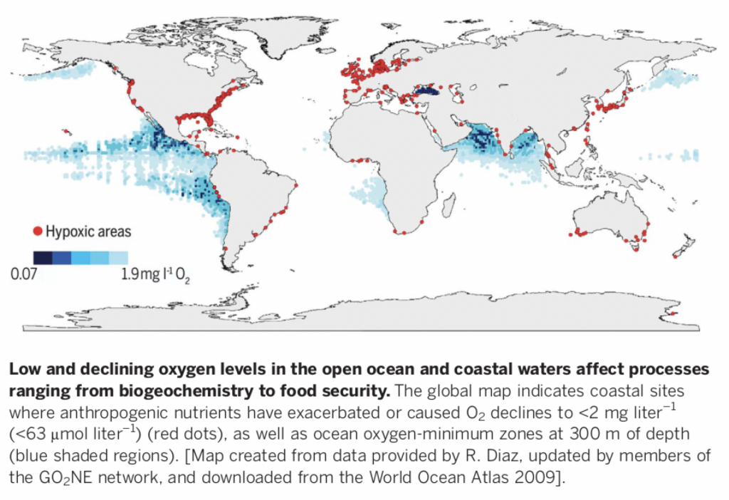
I wanted to make a figure that would show the distribution of oxygen minimum zones & oxygen-depleted coastal waters around the globe, something resembling this nice figure in Breitburg et al. (2018):
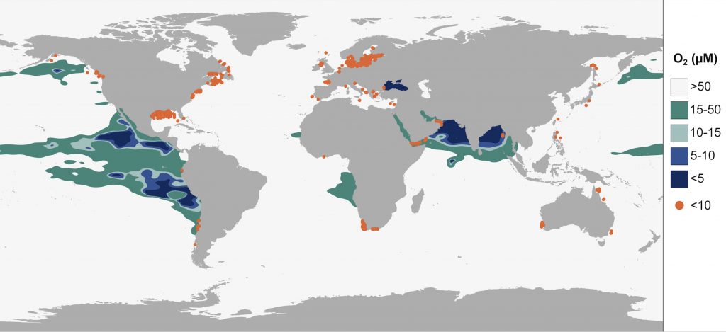
Ideally, I wanted a contour map based on extrapolated measurements from ~300 m depth and the points indicating oxygen-depleted coastal waters to only show concentrations <10 µM oxygen (not <63 µM as in the above figure).
I built the data query at WOD using this link, where I amongst other things could specify coordinates and secondary parameters.
I chose to download the data in WOD’s native ASCII format and subsequently filter the information I needed, since the downloadable CSV format appeared to come with a bunch of metadata I was not interested in AND I was also curious to try this python library by Bill Mills, wodpy, that reads and unpacks WOD data.
Since I was pulling a fairly large dataset – oxygen measurements from all available years and measurement devices covering the global ocean – I decided to download it directly to the university server and not to my laptop. Indeed it ended up being around 50 files of up to 500 megabytes each. Next up was then to find a smart way to read and extract the information I wanted from these 50 files and this is where the wodpy library came in handy!
The raw WOD ASCII format looks like this:
C41303567064US5112031934 8 744210374426193562-17227140 6110101201013011182205814
01118220291601118220291901024721 8STOCS85A3 41032151032165-500632175-50023218273
18117709500110134401427143303931722076210220602291107291110329977020133023846181
24421800132207614110217330103192220521322011216442103723077095001101818115508527
20012110000133312500021011060022022068002272214830228442684000230770421200000191
15507911800121100001333125000151105002103302270022022068002274411816302284426840
00230770426500000191155069459001211000013331250001511050021033011300220220680022
73319043022844268400023077042620000019116601596680012110000133312500021022016002
17110100220220680022733112830228442684000230770435700000181155088803001211000013
33125000210220160022022068002273311283022844268400023077042120000019115508880300
12110000133312500015110200210330535002202206800227441428030228442684000230770421
20000019115508880300121100001333125000152204300210220320022022068002273312563022
84426840002307704212000001911550853710012110000133312500015110200210220160022022
06800227331128302284426840002307704212000001100003328960044230900033267500222650
03312050033281000220100033289500442309000332670002227100331123003328100022025002
22900044231910033286200222900033115400332810002205000342-12300442324100332728003
32117003312560033280500
Although it’s human readable, it’s pretty weird… So here is where the magic happens! The below script reads the WOD format, extracts user-specified parameter, and writes them out in a CSV file. In addition to oxygen concentration and depth (z), I pulled latitude, longitude, year, and a unique profile ID.
--------------------------------------------------------------
from wodpy import wod
import pandas as pd
import os, csv, sys

# create empty dataframe
df = pd.DataFrame()

# script takes two arguments, in_file and out_file
in_file = sys.argv[1]
out_file = sys.argv[2]

# get current directory
cwd = os.getcwd()
fid = open(in_file)

p = wod.WodProfile(fid)

# make a dataframe and append to existing data
while p.is_last_profile_in_file(fid) == False:
    try:
        p = wod.WodProfile(fid)
        print(p.year())
        _df = p.df()
        _df['uid'] = p.uid() # unique ID
        _df['year'] = p.year()
        _df['lat'] = p.latitude()
        _df['long'] = p.longitude()

        df = df.append(_df)
    except:
        pass

# close the file
fid.close()
# write dataframe to current directory
path = cwd + "/" + out_file
df.to_csv(path)
print(out_file + "DONE")
--------------------------------------------------------------
To make the process more efficient, I used a bash script to call the python script repeatedly for all WOD files in the directory.
--------------------------------------------------------------
#!/bin/bash

for FILE in *WOD
do
    python3 wod_data_extr.py $FILE "${FILE}.done" &
done
--------------------------------------------------------------
Since I only wanted the oxygen measurements from 300 m for the extrapolation, the CSV files underwent another round of filtration using this python script (also called from a bash script like the one above).
--------------------------------------------------------------
import pandas as pd
import sys, csv
file_in = sys.argv[1] # csv file with data from WOA
out_file = sys.argv[2] # csv file with filtered data
df = pd.read_csv(file_in)
df_filt = df[(df['z'] >= 299) & (df['z'] <= 301)]
df_out = df_filt[["z","oxygen","uid","year","lat","long"]]
df_out.to_csv(out_file, sep=",", index=False)
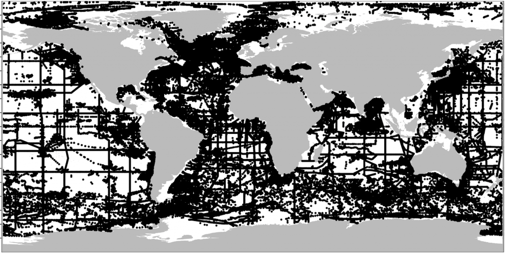
--------------------------------------------------------------Next I concatenated all 50 CSV files and imported the resulting file into R. Quickly plotting the datapoints using ggOceanMaps‘ basemap() function (by Mikko Vihtakari) shows the data density. Thus here it could be evaluated whether to use another depth interval for better coverage. I decided this was sufficient to try out the extrapolation.
The extrapolation was performed in R using the function mba.surf() (from the package MBA) that uses a multilevel B-spline extrapolation method.
--------------------------------------------------------------
mba <- mba.surf(DF_ALL300[,c('lon', 'lat', 'oxygen')], 500, 500, extend=TRUE)
dimnames(mba$xyz.est$z) <- list(mba$xyz.est$x, mba$xyz.est$y)
DF_extrap <- melt(mba$xyz.est$z, varnames = c('lon', 'lat'), value.name = 'oxygen')
--------------------------------------------------------------
The outputted data, DF_extrap, could then be plotted using ggplot:
--------------------------------------------------------------
colors <- c("#123973", "#3f66a7", "#abcbca", "#43978d", "#f8f8f8")   # Gradient of blues

p <- ggplot() +
  geom_contour_filled(data=DF_extrap, aes(x = lon, y = lat, z=oxygen),
                      breaks = c(0,5,10,15,50,Inf)) +
  geom_sf(data=world, fill="#BBBBBB", color="#BBBBBB", size=0.1) +

  scale_y_continuous(limits = c(-90,90)) +
  scale_x_continuous(limits = c(-180,180)) +
  scale_fill_manual(values = colors) +

    theme(
    panel.background = element_rect(fill = "transparent"),
    plot.background = element_rect(fill = "transparent", color = NA),
    panel.grid.major = element_blank(),
    panel.grid.minor = element_blank(),
    legend.background = element_rect(fill = "transparent"),
    legend.box.background = element_rect(fill = "transparent")) +

    theme(axis.title = element_blank(),
        axis.line = element_blank(),
        axis.ticks = element_blank(),
        axis.text =element_blank()) +

  theme(plot.margin = unit(c(1,1,1,1), "mm"))
p
--------------------------------------------------------------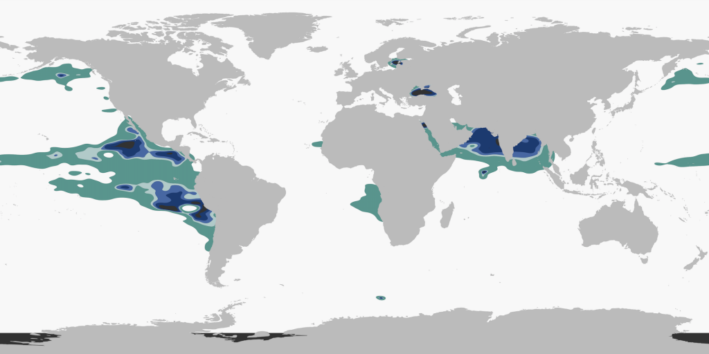
After including the coastal measurements of <10 µM oxygen (similar filtration as above, for depth and concentration) and performing some beautification in Inkscape, voila!